Mono Terminal单色终端
Monospace, dense data, and the calm confidence of a terminal.等宽字、密集数据,以及终端那种笃定的从容。
Where it is in its life它走到哪一步了
Still climbing, not yet default. The Are.na reference board is active (61 blocks). A real window before it’s everywhere.还在上升,尚未成为默认。Are.na 参考板活跃(61 块)。真正铺开之前还有一个窗口。
Weekly watchlist每周看板live实时
Ship it, don’t just see it不止看见,直接拿走
Copy the working snippet, or grab the palette and type as tokens for your project — CSS variables, Tailwind, or W3C design tokens. All free.复制能跑的代码片段,或把配色和字体作为 tokens 拿进项目——CSS 变量、Tailwind、W3C design tokens。全部免费。
What it is, and why now是什么,为什么现在
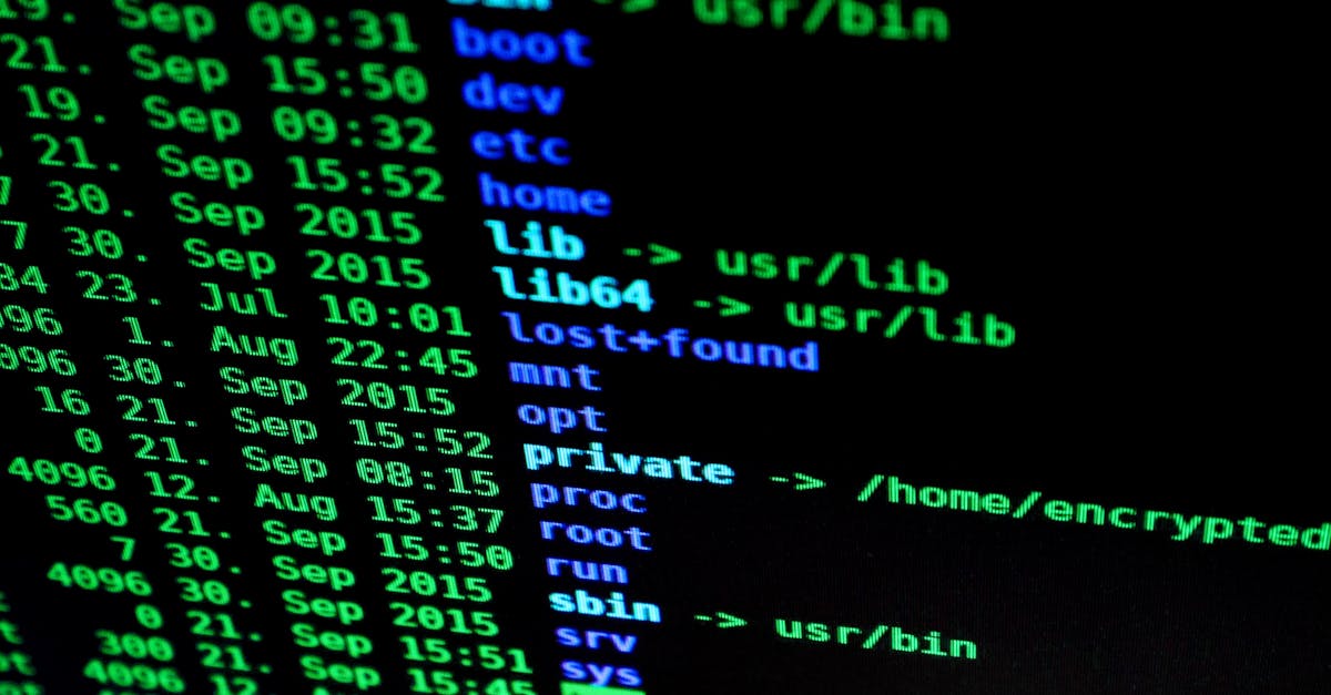
The mono-terminal look borrows from the command line: monospaced type, tight grids, high information density and almost no colour beyond one electric accent.单色终端借的是命令行:等宽字体、紧网格、高信息密度,除了一个电子色几乎不用颜色。
When to reach for it什么时候用它
Use for用在
- Developer tools
- AI products
- Data-dense back-ends
- Portfolios
- 开发者工具
- AI 产品
- 数据密集型后台
- 作品集
Avoid for别用
- Mass-consumer (needs warmth)
- Senior / kids products
- 大众消费类(要亲和)
- 老人/儿童产品
Colour, with roles配色 · 带角色
Type pairing字体搭配
Body — IBM Plex Sans.正文 — IBM Plex Sans。 Keeps captions and UI legible underneath it.让下面的说明和 UI 保持清晰可读。
Both open-source (Google Fonts), free for commercial use. Pairing + embed code in the Pro assets.均为开源(Google Fonts)、可商用。搭配与嵌入代码在 Pro 素材里。
It’s a material, not a filter是材质,不是滤镜
Set everything in a good monospace, lean into alignment (mono makes columns effortless), and add thin grid lines. One accent colour, used sparingly, keeps it from feeling cold and dead.一切都用好的等宽字,善用对齐(等宽让分栏毫不费力),加细网格线。一个强调色,克制地用,免得冷得没有生气。
Sources, not screenshots是来源,不是截图
Curated links to where this actually lives and gets documented — live boards for reference, editorial for pitch language, galleries to gauge saturation. We link out and credit rather than re-host anyone’s work.精选链接,指向这个方向真正活着、被记录的地方——实时参考板、给提案话术的编辑内容、判断饱和度的画廊。我们只链接并署名,不搬运任何人的作品。
A recipe配方
- Monospace type + high data density + almost no color plus one electronic accent + thin grid lines. Terminal feel, careful typesetting.
- 等宽字体 + 高数据密度 + 极少颜色配一个电子色 + 细网格线。像终端但排版讲究。
It’s all free全部免费
Every guide, the live timing, palettes and example images — all free. Get the weekly “what’s rising” email so you never miss a move.每份指南、实时时机、配色和范例图——全都免费。订阅每周“什么在涨”邮件,不错过任何动向。